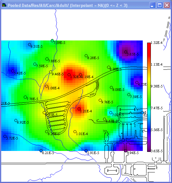
To display a modeled map of concentration to risk, make sure that your analysis type is set to Human Health and the desired contaminant and media are selected in the secondary toolbar.
Availability
This interview is available for human health analyses with pooled or unpooled data.
Steps
These are the steps that display in the Steps Window when this interview is selected. Click on the links below for more details about the following steps.
1. See the data
5. Interpolation Methods (this step is not enabled for pooled data with human health)
6. Correlation modeling (only available if OK or IK is selected under Interpolation method; not enabled for pooled data with human health)
7. Search neighborhood (only available if OK, IK, or Inverse Distance is selected under Interpolation method; not enabled for pooled data with human health)
9. Cross validation (this step is not enabled for pooled data with human health)
10. Format picture
11. Auto-document
When Show the results is selected, SADA will present the Risk Scenario selection window. After selecting the applicable land use and pathway(s), select OK. In the Graphics Window, SADA now presents a map or modeled risk values for the selected contaminants.