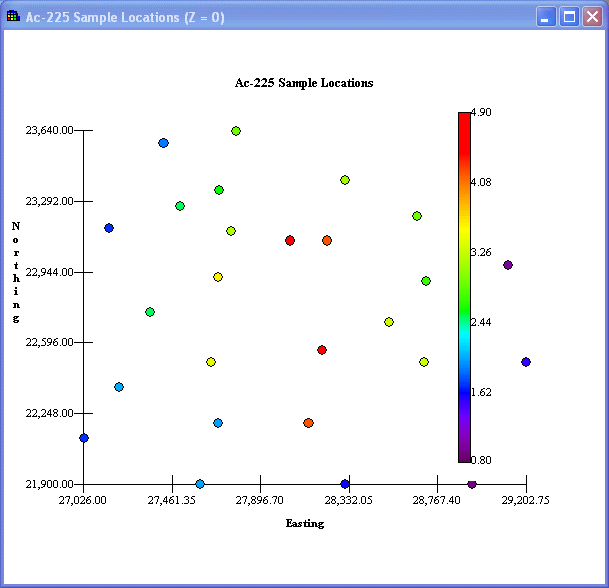
A data plot shows the location of data points relative to each other along with a color scale for noting relative magnitude. To construct a data plot, the spatial boundaries and the maximum and minimum sample values are calculated. The maximum and minimum sample values are used to construct the color scale where red denotes the highest value, black denotes the smallest value, and a spectrum of colors between identify the remaining values. A data plot is constructed by plotting a circle on the relative coordinate system and coloring it according to its magnitude.
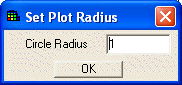
To change the radius of the circle, select Set Circle Radius from the Graphics menu. Enter the value of the radius and press OK.
For three-dimensional data, depth becomes a factor. SADA plots the data by layer in increasing depth values. To see these underlying layers, select the Set up the Site step in the Steps Window.